In the Seasons Color Analysis system, the springs color palette is warm and fresh. It’s the most delicate of the seasons, but also vivid and beautiful. Those who fit into this category seamlessly have a mix of light, warm, and bright characteristics.
The spring palette is low contrast and will echo your natural colours. If you have warm yellowish and peachy undertones in your skin and overall low contrast in your features, the spring colors are the best fit for you. These colors would also suit people falling in the Clear Spring, Light Spring , and Warm Spring colour palettes in the 12 Season Color Analysis system.
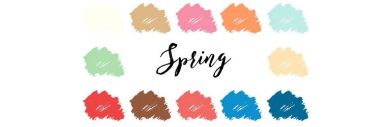
Spring Color Palette Characteristics
Are you a classic Spring? Check to see how many of the following characteristics match your natural coloring style.
Skin:
Spring skin tone is warm yellow and golden beige. You may have very fair skin with maybe some freckles. With a mix of peachy and golden undertones, your skin color tans easily. There’s not much contrast in your natural look.
Hair:
Your hair is a light blonde with a warm golden or strawberry blonde undertones. Light hair could even be a medium brown, but again with golden or red undertones. This color palette goes well with hair with a golden glow style that one has had since childhood.
Eyes:
While the brightness and clarity of the eyes is a general spring characteristic, the colors range from blue to brown. It could be green or topaz as well but marked with yellow to create harmony with your skintone and hair.
If you have these characteristics that fall in the spring palette, you should go for colours that are bright and warm. For those who normally have lighter skin but easily get tanned, a seasonal colour that is warm and rich colours is a better option.
Spring palette overlaps a bit with the winter palette, but without the stark contrasts. For those who have a bit of contrast, the Clear Spring palette is the best fit, as it’s the highest contrast within the spring season category.
Spring Colors Palette
The true spring palette is all about bright, warm, and light colors, that have little to no contrast with your natural colors. This essentially discards dark colours that overpower your range of colors. Even though you’re going for harmonious colors, you should avoid fleshy neutrals or muted pastels as they are more in the cool category.
The true spring shades are perhaps the warmest of all, beginning on the golden end of the spectrum to more vivid colors. When looking at all seasonal color analysis together, the warm spring colors would fall closest to the autumn colors. So you can work with warm autumn colors too, as long as they provide a harmonious effect.
Speaking of harmony, that’s the basic key to find the best spring seasonal color for yourself. Unlike winter, you’re going away from high contrasts and looking for colors that blend with your natural characteristics.
Even if you’re not a classic spring, you can create the so-called harmony, as long as you use warm and light colors. This would include warm greens, yellows, peachy pinks, orangey reds, pale beiges, and light browns.
For those with contrasting features, finding the right seasonal color for spring can be a bit tricky. Here’s a guide to help you track the spring colors best suited for your natural colors:
- For those with high contrast features, for instance, fair skin with brown hair and green eyes, the best choice would be clear spring and bright spring tones, as it offers the most contrast. This would include saturated colors but with warm undertones to maintain the essence of spring.
- For those having relatively less contrast, like clear green eyes and ashier hair, light pastel colours are the go-to for spring. These colors are never dark or heavy, so create a harmony with the lighter colors of your eyes, hair, and skin.
Generally, pastels are often associated with bright spring. However, not all pastels could be classified as warm spring seasonal color, and certainly not for all skintones and hair colors. This is mainly because pastels have a cool effect, and with light spring, you’re going for warm undertones.
The worst pastels for spring are those with dark, cool shades and blue tints. This would include the most bluish pastels and some purples. Similarly, white is not the best color for spring, especially if you have deep golden brown, strawberry blonde, or coppery red hair, with bright sunburst pattern in the eyes.
Generally, the pale the pastel the more suitable it is for warm spring. So you have your pale peaches, pale aqua, pale mint green, primrose, cream, light sand, and vanilla. All these colors are subtle and do not stand out so strongly against your skin or hair.
One seasonal color, in particular, that fairs well with natural springs as well as others, is pale yellow. More on the citrus spectrum of pastels, this color will create very little contrast, given your yellow undertones. If that’s too light for you, a golden yellow color is a bright alternative, still maintaining the undertones of warm spring.
For those who want less warm hues, there are still plenty of choices. Hot pink, cherry, salmon, spearmint, marigold, charcoal, royal, and lime are the best colors with less warmth. They are still fresh and soft enough to create the right balance.
Prints and Patterns
Spring color palette provides a great playground for prints. You can mix prints and patterns, using mostly light and warm colors. However, some dark colors may be used as accents, as long as they do not overpower and make the overall aesthetic heavier.
Usually, floral prints are pretty popular for spring, but floral does not always mean cool colors. Floral prints in warm pastels will keep the integrity of spring alive by providing a lighter feel. Also, you do not want to combine too many colors, as that’s something you can accomplish better with summer colours.
Black is not in the spring palette but may be incorporated with other spring colours. So if you want to wear black, use it in a pattern, perhaps stripes. You want to go with brighter colors like salmon or coral and keep those near your face.
Sister Season
The sister season of spring, based on the original Color Me Beautiful 4 seasonal color analysis, is the autumn season. The overlapping aspect is the warmth of the colors. So a warm seasonal color of autumn may also work in the spring season.
Generally, you want to avoid dark colors as you’re going away from strict contrast. Therefore, avoid any warm colors that are perhaps too dark for spring. These could include teal, crimson, maroon, dark greys, and dark browns.
As you explore the seasonal color analysis for all seasons on a single spectrum, you will see many crossover colors. While crossover colors exist for autumn and spring mostly, you will see some spring and summer crossover colors too, mainly in the Light Spring palette of the 12 Season Color Analysis.
Spring Makeup
The spring makeup should be light and allow your natural glow to be the hero. So you want to stay away from overpowering dark tones that you can get away with in winters. You want to bring out the natural eye color, personal skin tone and hair colours.
The main color you’re going for, as far as the foundation is concerned, is yellow. So pick up from that and go with a foundation that’s appropriate for your skintone, but has yellow or peachy undertones.
Spring is also the lightest of the seasons, so you can go with clear and transparent pigments too. The lighter the color, the better it is for the spring makeup. On the other hand, those looking for makeup closer to the winter palette should use the Clear Spring palette.
While not exactly dark or heavy, you can even incorporate metallic and silver in the eye makeup. Again, these type of bright colors that border on the cool is as far as it gets to get a contrast. These less warm colors can make your eyes pop out.
Seasonal color analysis spring also includes light brown shades, especially with green eyes. In general, just keep the tones light even if you’re using a traditionally dark color. In spring makeup, you should avoid any kind of black, even with mascara. You do not want to overpower the lightness of the spring seasonal colors.
The best lipstick colours for spring are:
The best colors for spring eyeshadow are:
The best eyeliner color for spring are:
Avoid monochromatic makeup for your spring looks, as you want it to be bright like giving life, not boring. This color palette is the closest to the natural colors of the skin with its yellow and pale pink tones. So for those who like minimal makeup, this palette is more color balance. It will mimic your skin tones.
For makeup, using the 12 Seasonal Color Analysis can give you more flattering colors, as it also incorporates some mildly cooler and brighter colors.