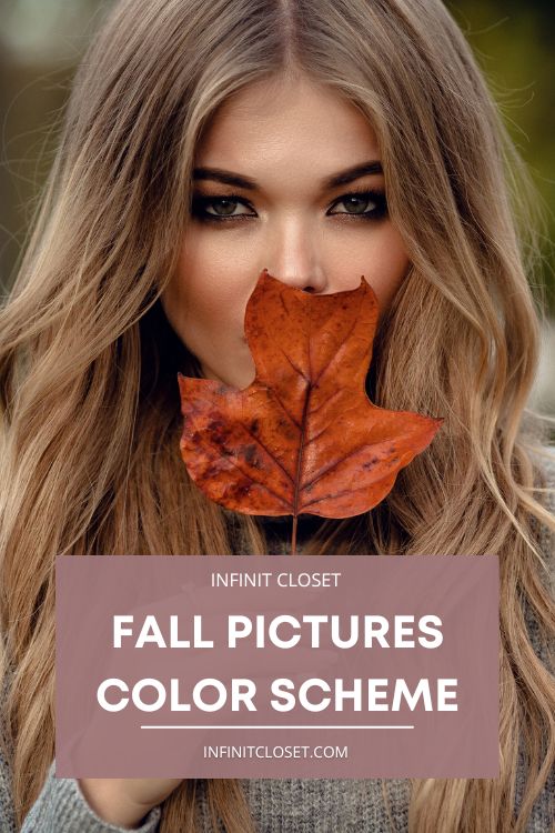
After days of scorching heat and glorious sun-tanned skin, we welcome the cozy fall season. People tend to redecorate with the approaching colors of fall, including taking new fall pictures. Fall allows you to layer up and add more definition and texture to your outfits, accessories, shoes, and overall vibe.
Picking out full outfits for the entire family might be a bit daunting. So, to make this family photo session only a source of happiness for you, we bring you the fall pictures color scheme that will surely bring you the energy you need to welcome fall. With our suggested tips, the fall pictures color scheme will be easy for you to pull off.
What You Should Keep In Mind
The first thing you must remember is that you should never overly match the outfit shades. Everyone wearing the same colors matching with the backdrop will make the pictures bland. Therefore, try to incorporate different textures and materials so that the layers stand out. Also, ensure that you do not strictly follow the color scheme that you think would look great in the fall. Instead, try incorporating colors that would complement these fall shades.
Next, pick accessories that would bring the right amount of glamor to your pictures. They should not be too loud so that they become the focal point of the pictures, nor should they be too bland. Keeping this in mind, adding an appropriate number of accessories will add a personality to the pictures and keep them from being just another fall photoset.
Stunning Fall Pictures Color Schemes
There are multiple color schemes that you can pick according to your liking. These color schemes can be chosen based on the aspects of the picture you want to focus on.
Your handpicked shades will ensure that you get the photoshoot of a lifetime. Moreover, these shades will bring the cozy fall vibe into your home and add personality to your family portraits. Below are some color schemes that would work well with your fall pictures.
Warm Neutral Shades

Warm, neutral shades work for all seasons. They have a classic vibe to them. Furthermore, they will ensure that you remain the focal point in your fall pictures. These shades are not too bold to distract the viewers from you and your family’s smiling faces.
Warm shades are typically along the lines of ivory, beige, cream, coffee, gray, blue, green, or pastel pink. When going with the warm neutral shades, you should remember that any sort of bright and vibrant color will not complement the fall shades you want. Moreover, these are not difficult shades to work with, but they can easily look bland if not handled properly. Also, it would help if you were careful not to let these muted shades get lost in a sea of vibrance and bold shades.
Rich Jewel Tones
Jewel shades are the most prestigious choices for the color scheme of your fall photographs. They are surprisingly easy to work with and coordinate within a warm fall landscape. The shades are typically those in natural jewels. These shades include royal blue, topaz, ruby red, plum, teal, and gold.
When incorporating these in pictures, you may want to make sure that you do not use all of them at the same time. This mistake might make the pictures look overcrowded and not bring the calm fall vibe you might be looking for. Overall, these jewel shades are bound to make your family pictures look like an illustration from a fairy tale.
Earthy Shades
The natural, earthy shades work great when you want to do a fall look with them. They bring a certain kind of spark to your pictures and give them a natural vibe. Shades like olive green, dusty brown, blue-gray, burnt orange, muted gold, and a dull dark mustardy yellow are your go-to with this color scheme.
Here, you might want to be quite vigilant in picking the background. It should match the earthy vibe, but not too much. Otherwise, you could start looking like a part of the landscape. Earthy tones of blues, greens, and grays look beautiful in such a surrounding. These shades would make sure that you have the right pop of color that you need to not blend into the background.
Shades of Pumpkin Spice
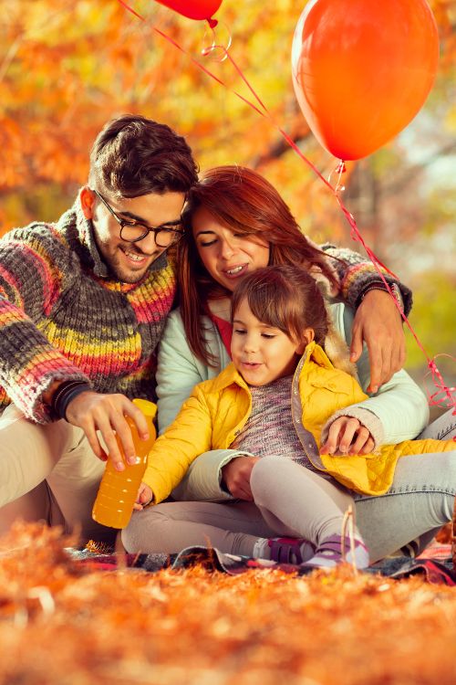
Lastly, we bring you the ever-beloved pumpkin spice shades. You can’t go wrong with orange, browns, purples, and dark reds. These traditional fall colors look beautiful, especially if you’re considering an outdoor photoshoot. The falling leaves, gloomy weather, and tree bark will complement you beautifully.
For the traditional fall picture color scheme, you can spice it up by adding reds and purples to your outfit, makeup, and accessories.
Conclusion
Your choice of fall pictures color scheme will enhance your ordinary family photo. If you plan on having these pictures on the walls all year round, they will provide a seasonal vibe that you can adore year-round. The fall color schemes we’ve suggested in this article could work during any season. For example, they could give you a cozy feel in the summer, making you eager for fall to come around again. The neutral earthy tones could even brighten up the deepest, darkest winters. The beauty of these shades will also make spring shades stand out.
In short, your fall pictures color scheme is not something you should go wrong with. It should always bring you the warmth and comfort that you typically experience during the fall season. Moreover, these pictures are sure to bring a positive vibe into your home. Also, these would ensure that you are filled up with the warmth of the colors whenever you look at them.